
Windows and Web GUI User Manual
The purpose of this user manual is to assist the user in learning how to work with a software application developed with the Thinkwise Platform. This guide takes the reader step by step through all parts of the program so that they can become familiar with all the possibilities.
This manual only deals with the standard Thinkwise capabilities such as the maintenance of data. Specific calculations and controls fall outside the context of this document. The screenshots that serve as examples are taken from a standard Thinkwise application. The basic Thinkwise functionality works exactly the same in all applications.
The examples of the screen prints are based on the 'Insights' application that is included as standard with the Thinkwise Platform. Furthermore, the screen prints of the user interface are mostly created using the Windows user interface. It can be that you are using the Web user interface, which differs in detail from the Windows interface.
Logging in
When the program is started up it is necessary to login, unless logging in takes place automatically, depending on how this is set up by the system administrator. As soon as the screen below appears then it is necessary to login yourself.
Enter the user name and password and press 'OK'
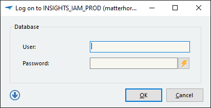 The Login Screen
Password expired
If your password has expired then the following screen appears after logging in.
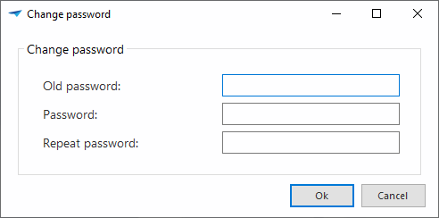 Change password
If the password is successfully modified then the application starts up.
It can also be chosen to skip this page. The application will then start. The possibility to change the password will appear again the next time the user logs in.
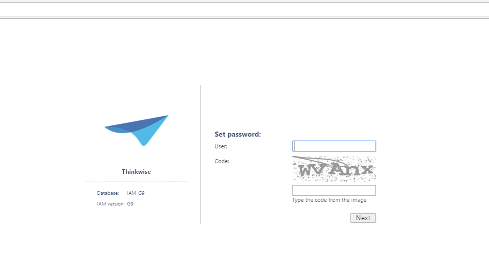
Setting the password prior to logging in
From the Web GUI it is possible to set the password if this has been forgotten or if the password is not yet known.
 Set a new password
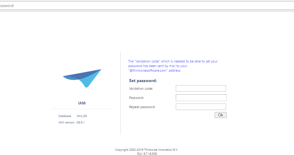
The following screen appears if the 'Set password' link is clicked on. Enter the user name and the code that is displayed in the picture. If inputting this code is not correct, then please try again. A new code will then be displayed. If the code is not legible then a new code can be requested by pressing the F5 key.
 Request password
By clicking on 'Next' the following screen appears. In the meantime an email will be sent to the email address of the user. This contains the 'Validation code' that is requested in the following screen. Additionally the password can be entered here. When typing in the password a 'Strength' is displayed that indicates the strength of the chosen password. A strong password consists of uppercase and lowercase letters, numbers and special characters and is at least 8 characters long.
 Password strength
The password can now be set by clicking on OK. The user will receive an acknowledgement of this.
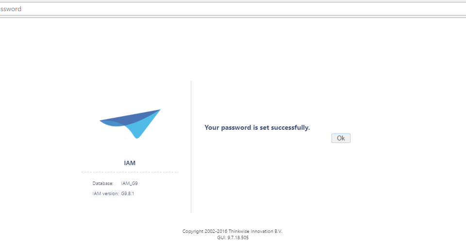 Successful change of password
After this the user is returned to the sign in page to be able to login with the new password.
Main screen
When the program starts a screen similar to the one shown in the following example is displayed.
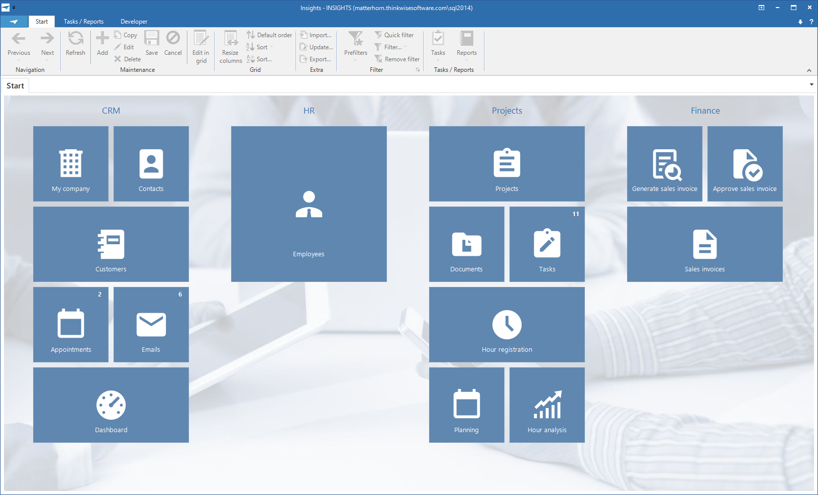 The main screen
This screen consists of three parts:
- Ribbon
- Navigation bar
- Work screen
Ribbon
The ribbon contains a number of toolbars with their functions. Certain toolbars are only visible if they are applicable to the active screen. For example, the Business Intelligence toolbar is only shown if a cube or graph is active.
The various functions in a toolbar are also enabled and disabled depending on the context in which you are working. If, for example, a form is active, then the buttons in the grid are partially switched off and vice versa.
The various toolbars in the ribbon are briefly explained in the following paragraphs.
About
The About toolbar offers the possibility to close the application and to change your password. Change password is only visible if you are allowed to do this. When you click on this a screen appears in which you can enter your old and 2x your new password.
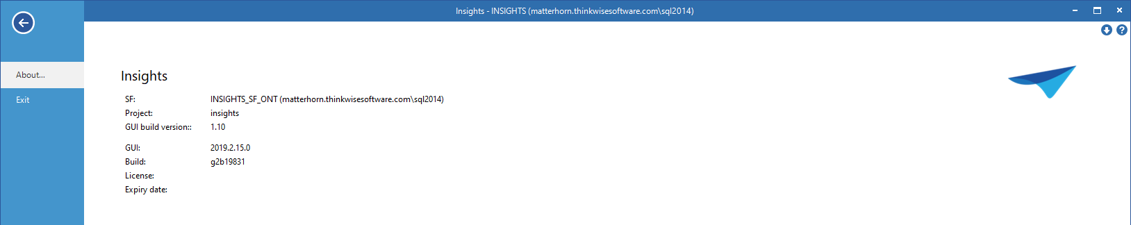 About screen
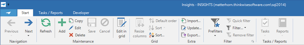
Start
The Start toolbar contains the standard functions for working with the Thinkwise user interfaces, such as navigating through and editing data, sorting and filtering, importing and exporting and an indication of active process flows. This toolbar is explained in detail in paragraph 3.1.2;
 Start toolbar
Tasks and Reports
This toolbar is able to call up tasks that are available on the work screen.
User preferences
This toolbar contains the functionality to modify the user interface for the current user, such as changing the language, changing the sequence and visibility of columns and tabs.
Active Process Flow
This toolbar is displayed when a process flow is active and shows the steps of the process flow.
Cube
This toolbar consists of functions that affect the cube view.
Graph
This toolbar provides the possibility to modify the colors, legend and form of the graph and display stored graphs.
Developer
This toolbar is only visible for developers. It contains options for refreshing the model, debugging facilities, automatic testing and the Application Logic monitor.
Navigation bar
After the program is started the navigation bar is displayed on the left side of the screen. It is possible to navigate to different parts of the program using the navigation bar. This is presented as a quick launch toolbar or a tree structure menu. In addition, the various applications can be navigated to using the application menu, this is always situated under the navigation bar.
Quick launch toolbar
The quick launch toolbar can be used to start the various parts of the program such as a work screen, a task and a report. These components are grouped logically.
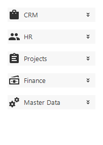 Quick launch toolbar with collapsed quick launch toolbar groups
By clicking open a quick launch toolbar group, the components of that group that can be started will be displayed.
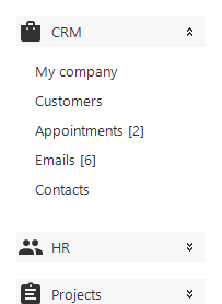 Quick launch toolbar with expanded quick access toolbar group 'Sales'
It is also possible to hide the quick launch bar, thereby creating more space on the work screen. Click on the pinned push-pin symbol at the top of the quick launch toolbar.
The quick launch toolbar then slides away to the left. To display the quick launch toolbar again the mouse must be held above the 'Quick launch toolbar' label. Click on the unpinned push-pin at the top of the quick launch toolbar to again fix the quick launch toolbar.
Tree structure menu
Apart from using the quick launch toolbar you can also navigate through the program with the help of a tree structure menu. This works almost the same as the quick launch toolbar, but it can contain several layers.
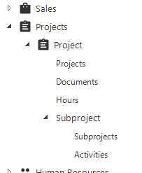 Tree structure menu
Application menu
The application menu may be visible at the bottom of the navigation bar. This is only visible if several programs are being used.
 Application menu
A program can be started by clicking on the associated button. The quick launch toolbar or the tree structure menu adjust themselves accordingly and work can start with this program. A distinction is made between programs that are already loaded and programs that still need to be loaded. Programs that are not yet loaded are shown with a red 'not-loaded' symbol.
You can also make the application menu smaller by clicking on the separator bar and dragging it downwards. When this is done only the symbols that are associated with these programs are displayed. By clicking on it the program opens in the same manner as with the expanded menu.
 Small Application Menu
Work screen
A work screen is opened by clicking on a quick launch bar or tree structure menu component. Data can be referenced and updated in a work screen. Among other things, tasks can be carried out and reports can be printed.
Tabs
 Tabs
Tabs
If several work screens are opened simultaneously (for instance via the quick launch toolbar) then it is possible to navigate between these screens with the help of the main tabs. To switch between work screens click on the tab of the required screen. It may be that work screens from different programs are open. If you click on the tab of another program then the quick launch bar or the tree structure menu will also change.
When an item on a quick launch toolbar, for which the associated work screen is already open, is clicked on the screen springs directly to it. It can however happen that you want to open a specific screen twice. To do this the user can click on the quick launch toolbar component, that needs to be opened again, by holding down the Ctrl key.
When opening a large number of work screens, there is the possibility that the user's system will become slower. This depends on the power and speed of the computer on which the user is working. To maintain the speed of the application it is advisable to close the screens that are not being used.
Screen components
The Thinkwise application screens are built up from various screen components, which can be combined on one type of screen according to the wishes of the developer. The standard types of screens that are available are discussed in the following chapter. This chapter presents a summarized overview of the available components.
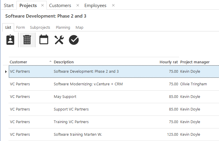
Grid
The grid contains a summary of the data displayed in a table. These are shown in rows. You can navigate through the data and adjust the sort sequence by clicking on a headling.
 Grid view
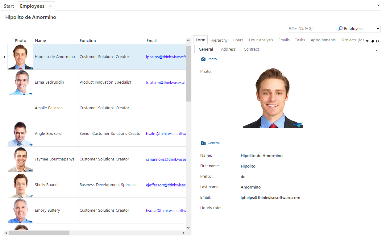
Form
The form contains the data of the currently selected row. Using the form it is possible to update and delete this row or to add a new row.
One form can include several tabs. This depends on the available amount of space.
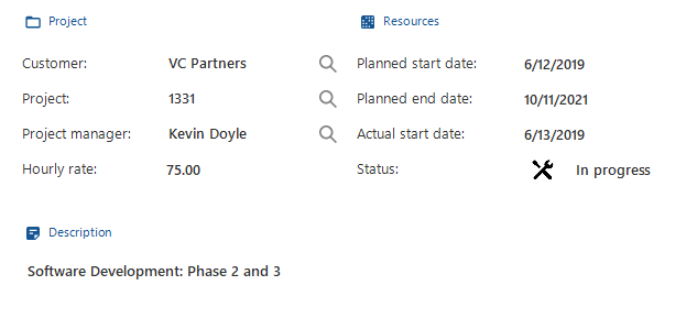 Form View
Cube and graph
Business Intelligence information is made visible in the form of cubes (pivot tables) and graphs, which are mutually linked. Pre-defined overviews can be opened or overviews can be created by dragging fields.
 Cube view
 Graph view
Filter form
The filter form is used to restrict the amount of data to that what is required. For example, it is possible to request all those persons who live in the vicinity of Amsterdam. This can also be applied to numbers, so that it can be examined whether a number is higher or lower than a specified value.
 Filter form
The following conditions can be applied during filtering:
- Begins with (Text) - The data begins with the entered text.
- Does not begin with (Text) - The data does not begin with the entered text.
- Contains (Text) - The data contains the entered text, independent of whether this entered text is at the beginning or the end.
- Does not contain (Text) - The data does not contain the entered text, independent of whether this entered text is at the beginning or the end.
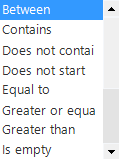
- Equal to (Text or Number) - The data is exactly the same as the entered text or numbers.
- Greater than (Text or Number) - The data needs to be greater than the entered number or text. Comparisons of text are performed alphabetically. Greater than B will exclude all words with an A. Greater than Be will exclude everything with Be and lower.
- Greater than or equal to (Text or Number) - The data needs to be greater than or equal to the entered number or text.
- Is empty - No data has been entered.
- Is not empty - Data has been entered.
- Less than or equal to (Text or Number) - The data must be less than or equal to the entered number or text.
- Less than (Text or Number) - The data must be less than the entered number or text.
- Not equal to (Text or Number) - The data is not the same as the entered text or numbers.
- Not between (Number) - The data does not lie inclusively between the entered starting and ending numbers.
- Between (Number) - The data lies inclusively between the entered starting and ending numbers.
Pre-filter bar
The pre-defined filters can be easily enabled and disenabled with the prefilter bar.
 Prefilters menu
Prefilters can be divided into groups in which only one prefilter may be active. As soon as a prefilter in such a group is enabled all other prefilters in that group are disabled.
Tasks and report bar
A tasks or report bar displays all available tasks or reports as buttons on the screen. These can be displayed both horizontally as well as vertically.
Combined filter
The combined filter is a filter field that is permanently visible on a screen and on which several fields can be filtered at the same time. Only the rows are displayed for which at least one of the fields contains the entered filter value.
 Combined filter
Types of screens
If the user opens a screen the information is displayed in the window on the right of the quick launch bar. As a default there are five types of screens available; a master-detail screen, a vertical master-detail screen, a hierarchically screen, a popup screen and the Business Intelligence screen. In addition, there may be customized screen types available. The default screen types will be discussed in the following paragraphs.
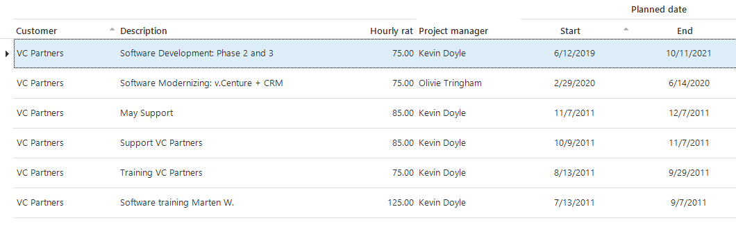
Master-detail screen (horizontal)
 Master-detail screen
The master-detail screen is divided into two parts, the main category (master) and the associated sub-categories (details). In this example the main category is 'Emails' and the associated sub-categories are 'Content' and 'Details'. The sub-categories are classified in detail tabs. When different emails in the list of emails are clicked on, the content and the details will also change.
Master-detail screen (vertical)
 Master-detail screen (vertical)
Along with the horizontal master-detail screen there is also a vertical master-detail screen available. This works the same as the horizontal version except that the grid is positioned on the left of the form instead of under it.
Hierarchy screen
The hierarchy screen consists, just as the master-detail screen, of a main category with associated sub-categories, only these are displayed differently. In this screen the first tab is the grid of the main category and the second tab the form. These are followed by the detail tabs with the sub-categories.
This screen is particularly suitable for a main category with many fields or data. Indeed on the second tab almost the entire screen is available to display the fields. The advantage of the master-detail screen is that the grid and the form are displayed simultaneously.
When the user opens the detail screen in a grid the name of the data being displayed is shown in the top left of the work screen. This example concerns the customer 'Antea Group'. The user can select the data in the grid that he wishes to be displayed or that needs to be updated. The details of the data that is selected is then displayed in the form.
TIP
If several items of data are selected, then only the last one selected is displayed.
Popup screen
The popup appears 'from the screen'. The screen always appears in the middle. The layout of the popup screen can differ for each action that is executed.
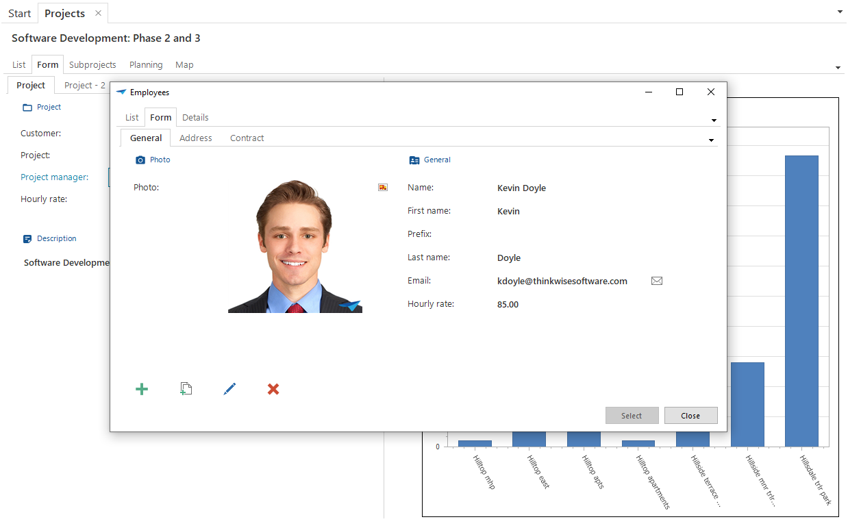 Popup screen
Functions in the grid
All functions that appear in the grid part of the screen are dealt with in this chapter. There are a large number of functions in the grid. Some are immediately available on the screen, others via the so called context menu, which appears when the right-hand mouse button is pressed.
On the screen
There are a large number of functions in the grid that are directly accessible using the mouse.
Selecting a record
To select one record click on the record that you want to select. As soon as a record is selected the information can be examined in the detail screen and the sub-categories of the record are available. A selected record can be recognized by the triangle in front of the record and the dotted line on the record. It can also occur that this record changes color, as can be seen in the figure below.
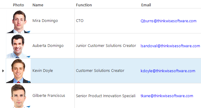 The third record is selected
Selecting one cell
To select one cell click on the cell in question. This is particularly useful during a quick search as discussed in paragraph 6.1.4. The cell that is selected gets a dotted line round the cell.
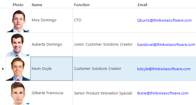 The cell 'Jeroen van den Belt' is selected within the selected record.
Sort
There is the possibility to sort on the screen in which the data is displayed. To sort click on the column label above the data. Sorting can be either ascending or descending. This Alternates with each click on the label and can be seen by the arrow next to the label. In the following figure this arrow is visible next to the column 'Name'.
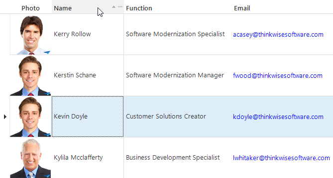 Sort within the grid
Along with sorting on one column it is also possible to sort on several columns at the same time. To sort on several columns, hold down the Shift key, while clicking on the columns on which needs to be sorted. The column that is clicked on first, is the first sort key, the following columns that are clicked on act within the first sort key.
Quick search
When there is a large amount of data on the screen there is the possibility to do a 'quick search'. First select a cell in the column on which must be searched and type in the first letters of what must be searched for.
It is also possible to do a quick search on whole words, by typing these one after another.
With a quick search it is easier to work with a sorted set. When, for example, you do a 'quick search' on a name it is useful to first sort this
⚠ If there are very large data sets it may be that the designer has decided to not display all the data in the work area but, for instance, only the first thousand records. The search only takes place within the current work screen. This can be recognized by the icon in the shape of two pages on the top left of the grid. It is advisable, when this icon is displayed, to first filter to ensure that all data which is required for the search is displayed in the set with data.
Opening a record
Opening a record in the grid section of a hierarchy screen
Double click on a record to open it.
When a detail must be opened in a new screen, double click on the record in combination with the Ctrl key.
Opening a record in a master-detail screen
Click on a record in the grid to open a record in a master-detail screen. The detail then displays the selected record.
Navigating through a grid (Web)
When using the product on the web it will be noticed that a grid is sub-divided into different pages. When the mouse is positioned above a column, this becomes visible with the figure below. These buttons can be used to browse through the pages.
 Page layout in the web
Toolbar
When the grid is selected a large number of functions are available via the 'Start' toolbar. Consider functions such as refresh, edit, search and filter. These functions will be explained one by one.
 Toolbar
A function can be started in three different ways. The functions followed by three full stops are always followed by a pop-up and therefore never start immediately. The functions without full stops start immediately, without a pop-up screen. The options with an arrow open a sub-menu with options from which a selection can be made.
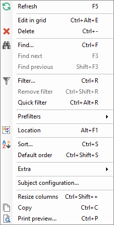
Most options are also available in the context menu, which can be called up by clicking on the grid with the right mouse button.
Refresh
Refreshing is the retrieval of data from the central database, so that the last modifications, possibly done by other users, are visible on the screen. This ensures that the most recent data is always worked with.
 Refresh in the toolbar
Refreshing is also useful if several tabs are open and these tabs influence each other, or details of tabs.
Refreshing is especially important if several users are working in the same screen because changes from other users are also processed.
Edit mode
The 'Edit mode' is used to quickly carry out a large number of modifications in the grid. By enabling this function it is possible to edit data in the grid. Normally speaking it is only possible to modify data in the Form View.
 Edit mode in the toolbar
Search
When you start searching the selection jumps to the first record that meets the search criteria. This ensures that all the data of the work screen in which is being worked is examined.
⚠ As already indicated earlier, during filtering, it is possible that not all the data is displayed due to the large amount of data. To make the required data visible the date must first be filtered prior to searching.
Find
The 'find' function can be found under the context menu. This can be used to search for data that is visible on the screen at that time. When 'find' is clicked on a popup appears in which it can be indicated what needs to be searched for.
 Searching in the context menu
In the popup is indicated for each column what must be searched for.
The 'find' option is not included in the ribbon.
 Search popup
There are various options to search on. The one to be used can be indicated in the drop down menu.
 Drop down with search options
Find next / find previous
When a search request is submitted it can be that several records satisfy the search criteria, it is possible to go to the next or previous search criteria with the 'Find next' and 'Find previous' buttons.
Filter
When filtering is applied all records from the work screen that do not satisfy the filter criteria disappear. This in contrast to search, with which all data remains visible.
There are two options available when filtering. The standard filter screen and the possibility for an advanced filter by means of filter expressions.
These filter options are available in the toolbar under 'Filter'.
 Select filter options
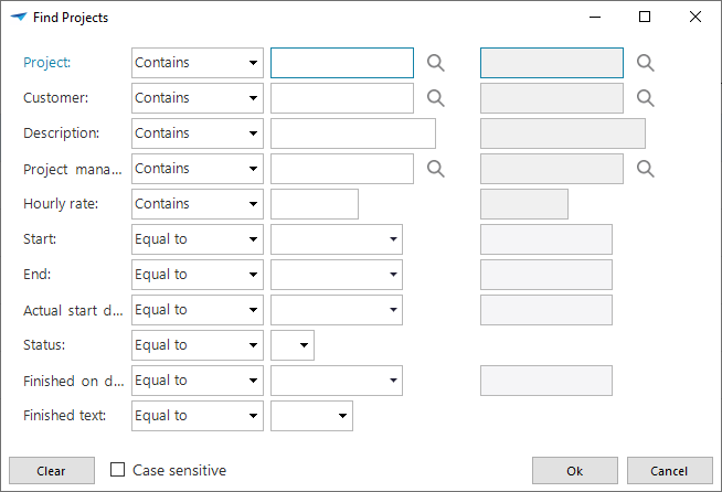
Standard filtering
When the 'Filter' option is chosen a popup appears in which can be indicated what must be filtered.
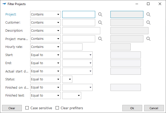
Apart from the filter options you can also indicate, with the help of check marks, whether the data entered for the filter must be case sensitive and whether the prefilters need to be cleared when the filter is active. As default one prefilter remains active, which can lead to certain data not being available due to the prefilter.
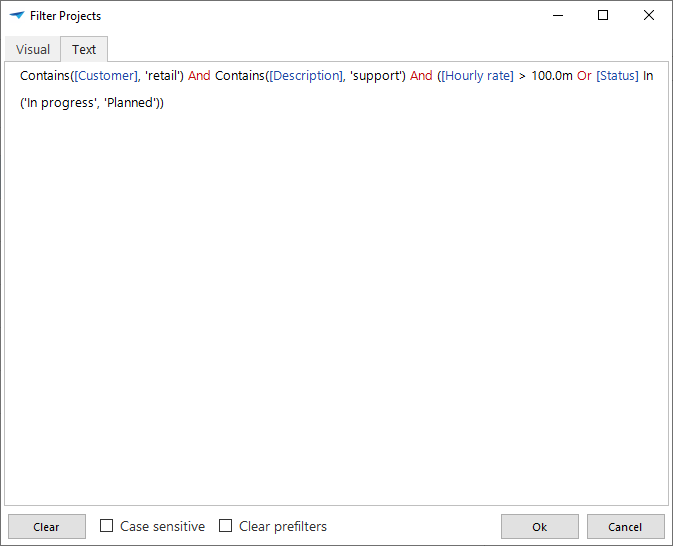
Filter with the help of filter expressions
When the standard filter window provides insufficient possibilities, then the filter expression window provides the option to compose advanced filter requests. It is therefore possible to check a field value against corresponding values; as a default one single value is possible as a check. By using the filter expression several values can be checked at once. For example, filtering a grid on the cities Apeldoorn and Enschede.
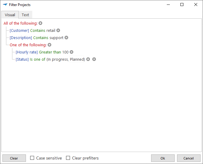 Filter expression visually
It can be derived from the example that all customers from Apeldoorn and Enschede are displayed, including whether a website is provided. The visual representation (1) of the expression is constructed in a tree structure, so that it is easy to see for each filter condition what it is used for. A filter condition can be a single condition, but it can also be a group of conditions. Relationships are then created between (groups of) conditions. These relationships can be AND, OR, NOT AND or NOT OR .
In the example a group is created containing two conditions which the values in the column Location must satisfy. It must include either 'Apeldoorn' or 'Enschede'. This group as a whole then has an ANDrelationship with the filter condition that the column website must contain a value. When everything is combined this gives: Website may not be empty AND (Location contains Apeldoorn OR Location contains Enschede).
Along with the visual construction of the filter expression it is also possible to construct the expressions with the help of text. To do this change tab Visual to tab text.
 Filter expression textually
The filter expressions cannot be created in the Web version.
Clear filter
When all data must again be visible the filters can be removed with 'Clear filter'.
Quick filter
The 'Quick filter' option can be found under the context menu'. This is a fast way of filtering one a specific criterion. First select the cell on which you want to filter and then click with the right-hand mouse button and select 'Quick filter' in the context menu. The column of the selected cell is now filtered against the value of the cell with the condition 'is equal to'.
This quick filter can be used successively several times on different columns. This additional filter conditions can be found by opening the filter screen itself.
When the quick filter is applied to a column for which a filter is already defined, then this earlier filter is cleared from that column.
Quick filtering works very well by making use of the quick key combination (Ctrl + Alt + R).
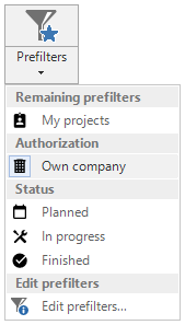
Prefilter
It may be that so called prefilters are present. These are pre-defined filters created by the designer that can be selected with one mouse click without having to manually set up the filter conditions.
For example, on a screen with employee details a prefilter 'Employed' can be defined that is active as default. After opening the screen only the employees who are employed are displayed. The prefilter needs to be switched off to see the employees who are no longer employed.
 Prefilter in the toolbar
Prefilters can be classified in groups. It is an option within a group that prefilters exclude each other. This means that when a prefilter is enabled the current prefilter in the group is disabled. This depends on the choice of the designer.
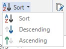
Sort
Sort
The data in a table can be sorted as required. Click on Sort in the toolbar or with the right-hand mouse button so that the context menu opens and select 'Sort'.
 Sort in the toolbar
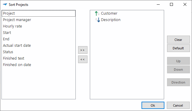
A popup window opens in which it can be indicated which columns must be sorted on. If several fields are selected then the sequence of the sort can also be determined. .
 Popup for sorting
A field can be added or removed from the sort with the left and right arrows. The sort is removed with the button 'Clear' and the default sort is re-applied with the button 'Default sort'. The sequence of the fields on which is sorted can be changed using the 'Up' and 'Down' buttons. With the 'Direction' button the sequence of sorting of one field is switched between ascending and descending.
Default sort
After a sort it is possible to return to the default sort, by clicking on 'Default sort' in the toolbar.
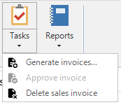
Tasks
There may be tasks available in the toolbar. A task is a specific assignment to execute a specific activity, calculation or procedure in the program. The task is always company specific and therefore we will not discuss it further here. If there are tasks available then these can be found for each work screen in the toolbar under Tasks. It can also be that this is displayed on the screen as an icon, depending on the set up that has been chosen by the developer.
 Tasks in the toolbar
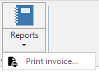
Reports
As well as tasks available in the toolbar there can also be reports present. When this option is selected the program generates a report on the basis of the data in your program. The reports are always company specific and therefore we will not discuss them further here.
 Reports in the toolbar
Examples of reports are a quotation, order confirmation, purchase order, sales invoice or an order picking list.
Other
Resize columns
When the width of the columns is changed, for instance, by widening a column, then this can be restored again. When this is done once the columns are set exactly so wide that the heading and the visible data are displayed. If 'Resize columns' is clicked on again, the columns are adjusted to only display the visible data. This may mean that the entire heading of the column is not visible, but you do not lose any space through a long heading above a column.
 Resize columns in the toolbar
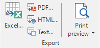
Export, import and update
When it is required to use data from a table in Microsoft Excel then this data can be exported. This is done with the function 'Export'. Along with exporting data it is also possible to import and update data.
Export
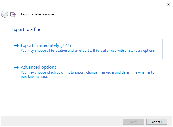
When data is exported, the user is guided through a number of selection screens.
It is firstly asked which rows need to be exported. The following options are available:
Selected rows
All rows in the grid
All rows in the grid (ignore maximum number of rows)
The last option is only shown if a maximum number of records is defined. This
can be recognized by the symbol  in
the heading of the table.
in
the heading of the table.
 Export options
On the following screen it can be indicated which rows must be exported with the help of check marks.
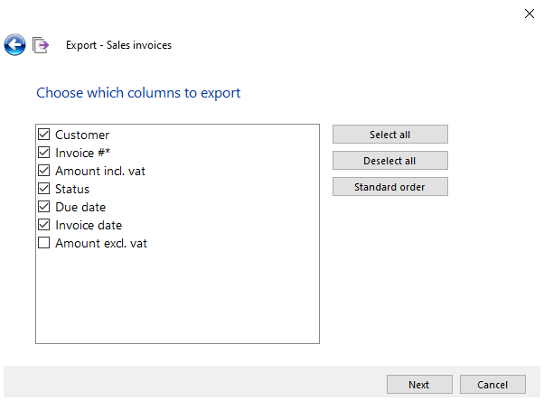 Which columns to export
It can then be indicated whether the column headings need to be exported and whether the IDs (the values that are in the database) or the translations (values that are displayed) of the column headings need to be exported.
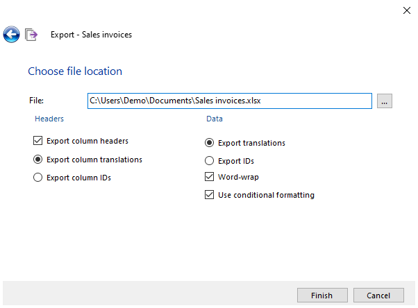 Export ID or translation
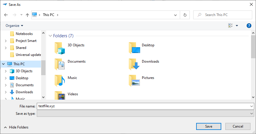
Finally the file name must be entered. As default the files are exported as
.xlsx files to the user folder. If the file type or the file location must be
changed then this is done with the  button
next to the field for entering the file name.
button
next to the field for entering the file name.
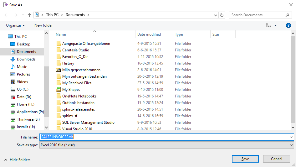 Storage location for exporting
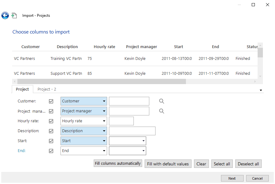
Import
Along with exporting data it is also possible to import data. Just as with exporting data there are a number of steps to go through when importing data.
When the import is started, which can be done via the toolbar, the location of the file to be imported must first be entered or browsed for.
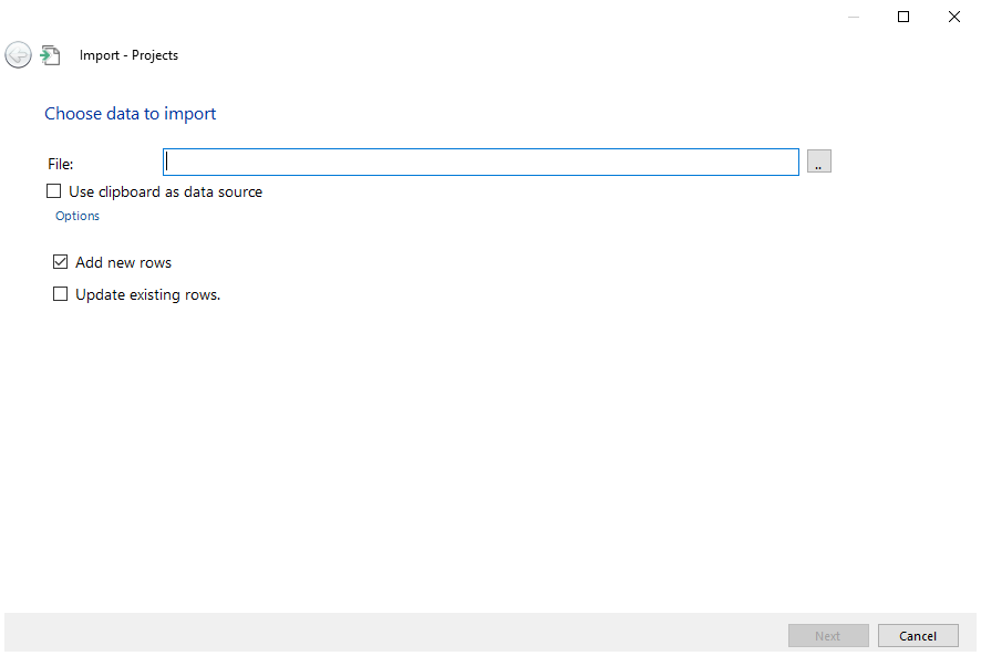 Import
The following screen is then displayed.
 File selection during the import
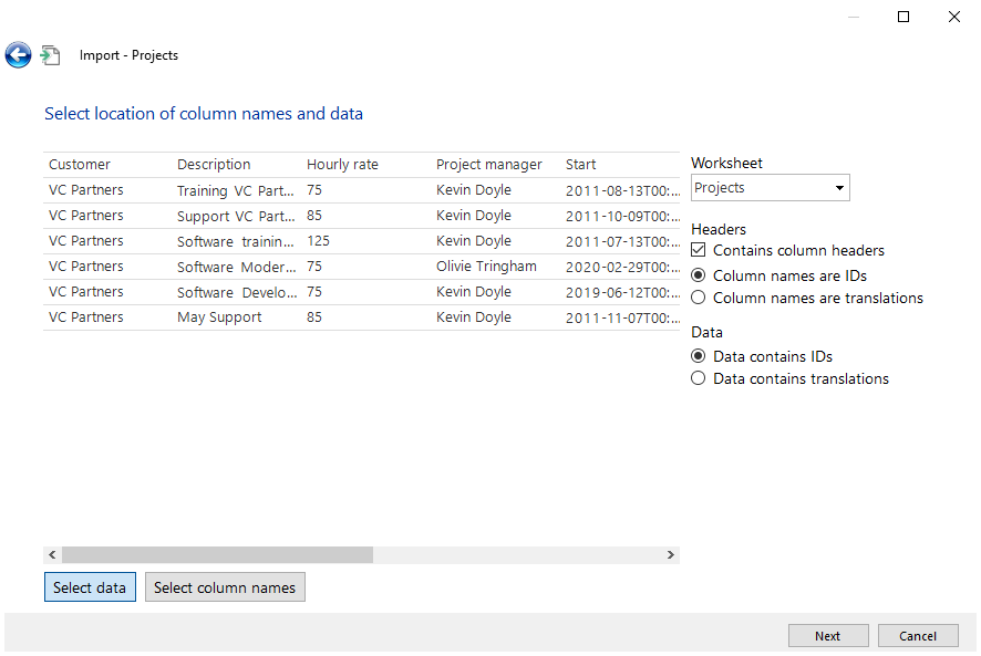
The data that must be imported is selected in this screen. This can be done by dragging the blue border. Furthermore it must be indicated with the check mark that the data includes column names. If this is the case then where the column names are located is indicated with the 'Select column names' button . (In most cases this is at the top and this is automatically correct. It is then indicated whether the columns are translations or IDs. When the required data and options are selected the Next button is clicked on.
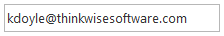
In the next window it is indicated with check marks which columns need to be imported and which column from the file corresponds with the column from the existing table. Furthermore the field can be left empty and an Alternative value may be entered in the field next to it (this applies to all the rows that are imported).
Note that there may only be database values in the file. Translated values cannot be imported.
Click on Finish to complete the import.
 Enter value during import
Update
Using the Update option large amounts of data can be modified at once. This takes place via the 'Update' function in the toolbar between Import and Export.
The following options become available when Update is clicked on:
Selected rows
All rows in the grid
All rows in the grid (ignore maximum number of rows).
Rows from a file
When the last option is chosen you can opt with a check mark to add non-existing rows, which are in the file, but which are not in the table.
After selecting one of the options the Update window is displayed. The value can be entered here for the columns that must be updated.
ℹ This option is not available in the Web version of the application.
Rows can also be updated from an Excel or CSV file. The choice can then be made to add non-existing rows or to only update the current rows.
Functions in the form
The form contains the data that is selected from the grid view. A field can
consist of data that comes from another table, such as with Country. By
clicking on the magnifying glass  next to this
field the underlying data is displayed in a popup. It is also possible to
execute a number of things directly, including sending an e-mail directly from
the data
next to this
field the underlying data is displayed in a popup. It is also possible to
execute a number of things directly, including sending an e-mail directly from
the data  , opening a web page
 or opening Google maps with an address
 . Also, a form can contain several tabs.
The form is provided with a form bar, that makes it possible to add or edit data or to navigate through it.
 Form bar
The form contains analogous functions as with the ribbon and context menu. It is therefore possible to use the same functions from the start toolbar or from the context menu.
Navigation
Adding data
Adding data can also be done from the form through use of the form bar, if this
has been made available by the developer. Press on  to add data. Then press on
 to save the data; or on
  to cancel the data input.
Editing data
Editing data via the form bar. Can be done by clicking on  .
.
Deleting data
Deleting data via the form bar takes place with the  key. It may be that data cannot be deleted, if
for example other data is dependent on it.
key. It may be that data cannot be deleted, if
for example other data is dependent on it.
Navigating through the data
From the form bar it is possible to navigate through the data with the arrow
keys 
 . To
go to the first or last record can be done using the arrow keys with a stripe
. To
go to the first or last record can be done using the arrow keys with a stripe

 .
.
Copying the data
Copying the data that is displayed from the form can be done with the  button.
Refreshing the data
Refreshing the current data that is displayed takes place with the  button.
Inputting data
Input fields
Various input fields are used within the application, each of which have their own function. The input fields can also include various ´states´, which consist of:
 Optional input field
 Required input field
 Read-only input field
Default input
 Default input
The default input field can be provided with textual input. The textual input consists of alphabetical characters, special characters and numbers. The input field is different depending on the type of data that must be entered. A number input applies for numbers and a date input applies for dates. These are explained in more detail in the following paragraphs.
Entering numbers
Number input
Only numeric numbers between 0 and 9, comma, full-stop or hyphen can be entered into a number input field.
Combination input
 Combination input
The combination input is set up such that it can contain various functions, depending on which field is active. It is possible from the combination input, to make a selection on several fields or open a calculator.
Select data

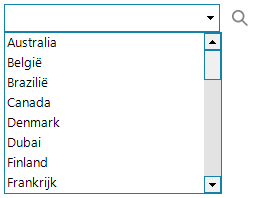 Data grid
If the magnifying glass is clicked on when in the combined input field, the grid is opened with data. By clicking on one of the data elements this is linked to the above data.
Calculator

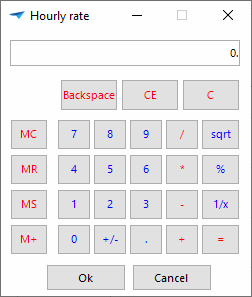 Calculator
If the magnifying glass is clicked on when in the combined input field, the window with the calculator is opened. The required calculations can be made within the calculator. The final result of the calculator can be confirmed with Ok_ or cancelled with _Cancel;
Color selector
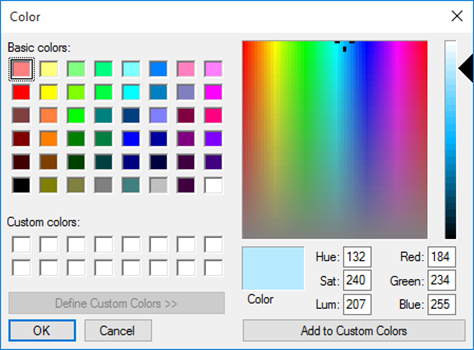 Color selector
If the magnifying glass  is clicked on when in
the combined input field, the window for the color selector is opened. One color
can be selected within the color selector. The color can be confirmed with Ok
or cancelled with Cancel;
is clicked on when in
the combined input field, the window for the color selector is opened. One color
can be selected within the color selector. The color can be confirmed with Ok
or cancelled with Cancel;
Date input
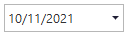
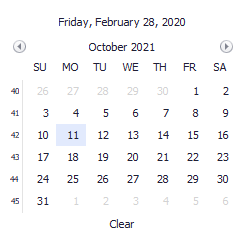 Date picker
If the date is clicked on in the date input field, the date picker will open. The date picker provides the possibility to select a date. The date picker can be emptied in one go by pressing Empty.
Time input
 Time input
Indicating the time can be done by using the up and down button, in addition the time can be entered via the keyboard.
Check mark
It may be necessary to confirm or deny something with the help of a check mark. A check mark is often filled in as default either with or without a check mark, but it is possible in some cases that neither of them is entered. The area in which the tick belongs then appears in color.
 Check mark not filled in, no confirmation, no denial
 Empty check mark, denial
 Check mark filled in, confirmation
File input
 Upload file
If the arrow is clicked on, then a window opens to store the file.
 Select file
Press on Save with the left-hand mouse button. Press on Cancel with the left-hand mouse button to stop the export.
Business Intelligence
Apart from updating data the program also includes possibilities to carry out analyses and present data graphically.
The Business Intelligence screen is divided into two sections, the cube and the graph sections. The data in the cube section can be clearly presented in the form of a table and the data from the cube can be presented graphically in the graph section.
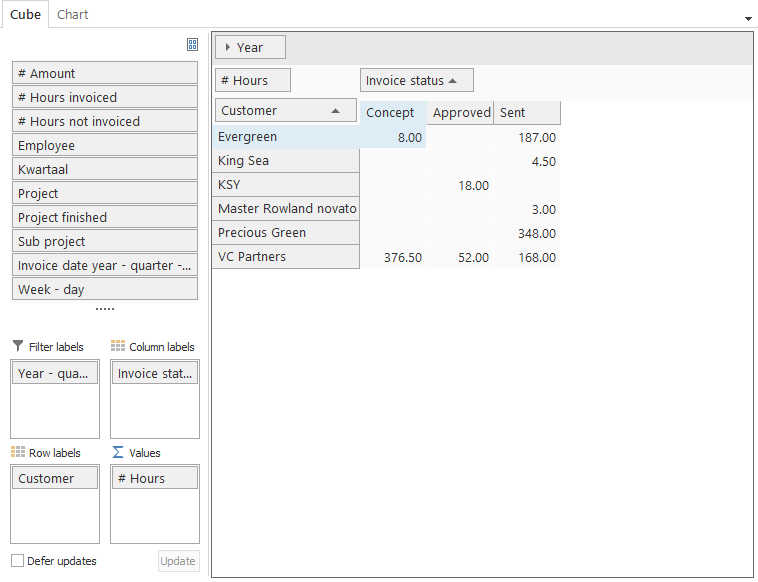
Cube
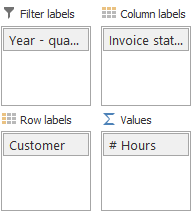
The cube is divided into two sections, the dimension and value bar (1) and the presentation screen (2).
 Cubes
Cubes
Dimension and value bar
The dimension and value bar contains the fields that can be used in the cube.
 Dimension and value bar in cubes
A distinction is made between the dimension and the value fields. The dimension fields are used to place a value in the cube or graph. The value fields give the result of that which needs to be measured. These fields always start with a # symbol.
To make use of the dimension and value fields, these must be dragged to the value bar. The value bar ensures that these are grouped in the presentation screen.
 Value bar in cubes
The value bar is sub-divided into four sections, each of which has its own role for producing the cube.
Filter label The type on which is filtered
Column labels Axis against which values are plotted (X-axis)
Row labels Axis against which values are plotted (Y-axis)
Values The type of value that is presented
If the dimensions are placed under the required row or column label and the value is under values, then the presentation screen will also be filled.
Presentation screen
The data is shown graphically in the presentation screen. The data that is presented is derived from the designated row and column label, which combine to present the value.
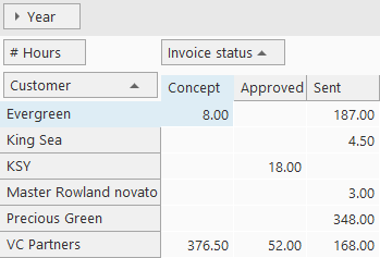 Presentation screen in cubes
Expanding and collapsing with several rows or columns
With a large number of rows or columns it is useful to expand and collapse them, depending on what is important at any given time. This can be done by clicking on the arrows next to the field that must be expanded or collapsed. Or by clicking twice on a column.
Sort on row or column labels
Sorting on a row or column label is useful to create an overview of a minimum or maximum result. Click on a row or column to apply the sort in descending or ascending sequence;
Display information behind the field in the cube
If a cube is calculated only the information that is relevant for the user is displayed on the screen. To retrieve the details of the underlying fields the field in question in the cube must be clicked on twice. The detail window is then opened.
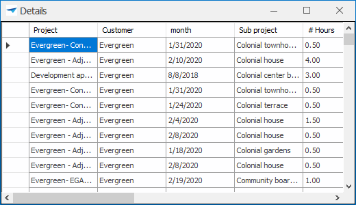 Detail screen in cubes
ℹ This option is not available in the Web version of the application.
Context menu
The use of the cube is extended with functions from the context menu.
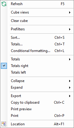 Context menu in cubes
Refreshing the cube
To retrieve the latest data for the cube it is useful to refresh it, so that the latest data is worked with.
Opening cube views
This allows predefined cube views to be requested. These are made available by the developer.
Advanced sorting with the cube
It is possible to apply an advanced sort for the cube, so that it can be indicated exactly how the sort must take place. An example of an advanced sort is given below.
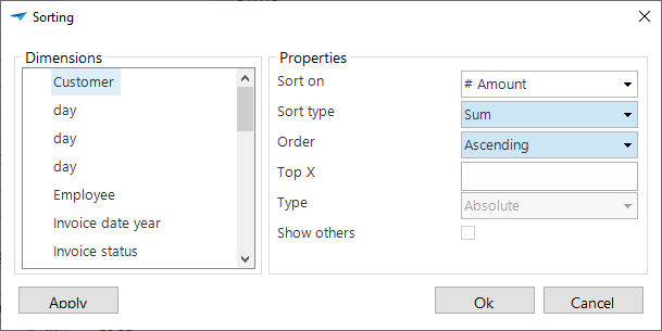 Advanced sorting in cubes
The options to display a top X provide the user with the possibility to not only present data in the cube but a top number of records or percentages. The function 'Display others' is then advised, so that the total value remains intact.
Setting totals of the cube
It is possible to calculate the totals for each row. For this it must be indicated with 'dimensions' which dimensions must be used for determining the total. Subsequently, with 'totals', it is indicated which calculation must take place for the total.
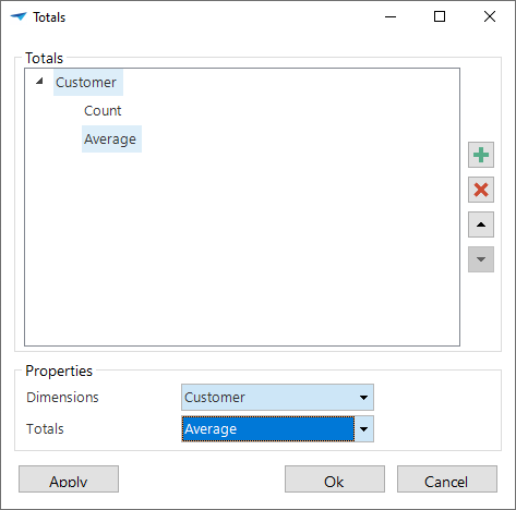 Totals in cubes
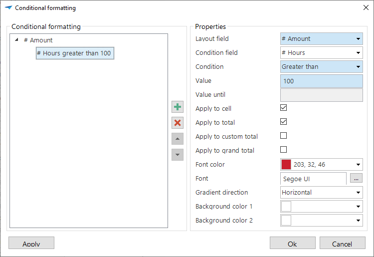
Set conditional formatting
It is possible to set up a conditional formatting for cubes via the context menu. To do this indicate for which field with which conditions this formatting must apply.
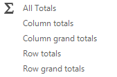
Display all totals
As default all totals are presented that have been given for the cube. Under Totals can be indicated which totals must be displayed.
 Display totals in cubes
Display the totals on left
Display the grand totals for the totals.
Display the totals on right
The totals are presented for the grand totals.
Applying a prefilter
There may be prefilters present in the cube. These are filters defined by the designer, so that these do not have to be created every time. It can also be that when a work screen is opened the prefilter is enabled by default. The content of the prefilters is always business specific and therefore we will not discuss them further in this document.
Exporting the cube
It may be useful to export the data that is composed with the cube to a file, so that this can be used for other purposes.
The possible file formats are displayed by clicking on Export from the context menu.
 File format for export within cubes
Print preview of the cube
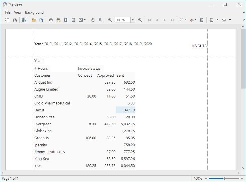 Print preview in cubes
The menu within the print preview window consists of several options;
| Option | Description |
|---|---|
 | Search within the view |
 | Modify formatting |
 | Open file |
 | Save |
 | Quick print, without selecting a printer |
 | Select printer and then print |
 | Modify page layout |
 | Modify header and footer text |
 | Modify the format of the document |
 | Drag through the document |
 | Zooming in and out within the document |
 | Navigating within the document |
 | Create an overview of several pages |
 | Modify the background color |
 | Add a watermark |
 | Export the document |
 | Send document via e-mail |
 | Close the print preview |
ℹ This option is not available in the Web version of the application.
Printing the cube
Printing a cube is also possible from the context menu.
ℹ This option is not available in the Web version of the application.
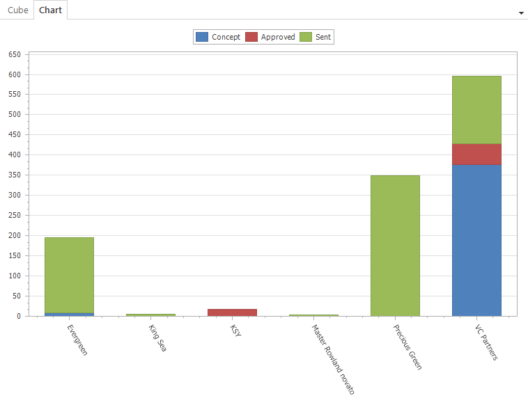
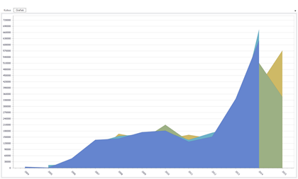
Graph
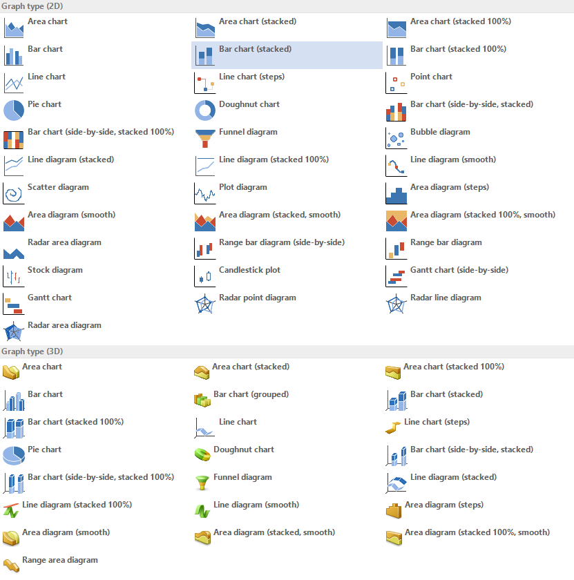
The data from the cube can be presented graphically, both two dimensionally as well as three dimensionally. Several kinds of diagrams are used for this, such as:
 Area chart Area chart | 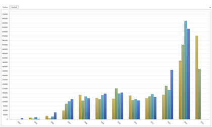 Histogram Histogram |
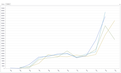 Line graph Line graph | 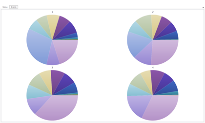 Pie chart Pie chart |
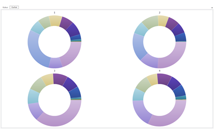 Doughnut chart Doughnut chart | 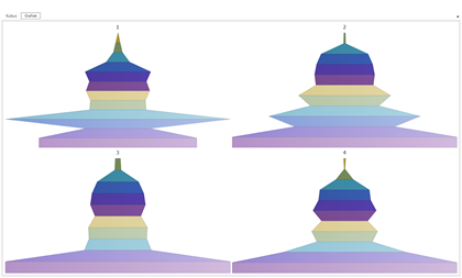 Funnel chart Funnel chart |
ℹ The graph cannot be exported from the Web version of the application.
On the screen
The actions that can be executed within the work screen in relationship with the graph are described in the following paragraph.
Selective graph
If a cube is used which contains a large amount of data, it is advisable to select one-or-more rows, so that the presentation of the graph becomes easier. Open the cube view for this. Select the required rows by clicking on the first one and keeping Shift pressed, click on the last row that needs to be selected. To specifically select a number of rows hold down the Ctrl button instead of the Shift button.
ℹ This option is not available in the Web version of the application.
Open the graph context menu
The graph view is provided with several functions that are available in the context menu.
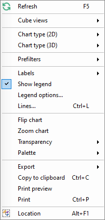 Context menu in graph
Set up two or three dimensional graph presentation
There are a number of different forms of presentation available to display the graph. These can be in a 2D or 3D format.
Display labels
The labels are displayed as default and show the value of a component in the graph or diagram. It is possible to indicate with the right mouse button whether the labels need to be displayed and where these should be positioned.
Display legend
Defining a legend with a graph is useful to indicate exactly what information is being presented. This can be called up via the context menu with Display Legend.
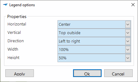
Set up Legend options
These options can be adjusted to more specifically indicate what is displayed in the legend. In the figure below it can be seen that the position of the legend and the format that this takes on the page can all be defined.
 Legend with graphs
Set up lines with a title
It is possible to define lines on the graph with a certain value. Along with the value the color, thickness and style of the line can all be adjusted. Furthermore, a title can also be assigned to a line.
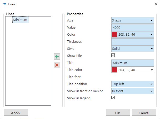 Setting up lines in graphs
Rotate graph (2D)
To view the graph from a different angle, this can be displayed in a horizontal and vertical view. By clicking on 'Rotate' graph the x-axis and y-axis are switched.
Rotate graph (3D)
It is possible to view a 3D graph from various angles. By rotating the graph using the 'Rotate' option the graph can be freely rotated on its axis. The 'Restore' option resets the graph to its original setting.
ℹ This option is not available in the Web version of the application.
Zoom in on the graph
To bring the graph closer, it is possible to zoom in on it via the 'Zoom in' function. This enlarges the graph. You can zoom in and out on the graph by scrolling on the mouse.
Tip
Along with zooming with the scroll wheel it is also possible by holding down Shift and clicking on the graph. To zoom out hold down Alt and click on the graph.
ℹ This option is not available in the Web version of the application.
Set up transparency in the graph
It is possible to define a specific transparency for the graph so that certain results are more visible. This can be set from 0 to 100%.
Set up the graph color palette
Presenting the graph in a different color scheme is possible by adjusting the color palette via the toolbar or the context menu.
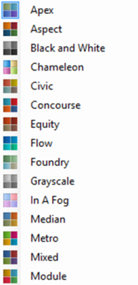 Color palette in graphs
User preferences
The user can specify his own preference settings with the help of the user preferences.
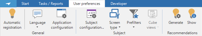 User preferences toolbar
If this option is not available in the ribbon, then the application manager can make this available via the Intelligent Application Manager (IAM).
The following preference settings can be specified:
The language
The application configuration
Configuration of the active subject
Own prefilters
Via 'Automatic registration' the user can register the settings that he changes whilst working with the screens, such as the height or width of the form or the grid, the width of columns and the status of the quick launch bar and the ribbon.
Language
If the application is set up for several languages, then the desired language can be adjusted via the user preferences. The desired language can be selected and the application will immediately switch to the language that is set up.
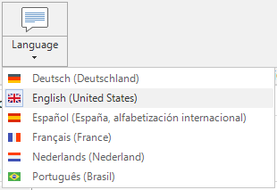 Language preferences drop down
Application configuration
With the help of the Application Configuration option it can be defined, which applications and subjects need to be started immediately when the application starts.
The following popup appears when opening the 'Application Configuration' .
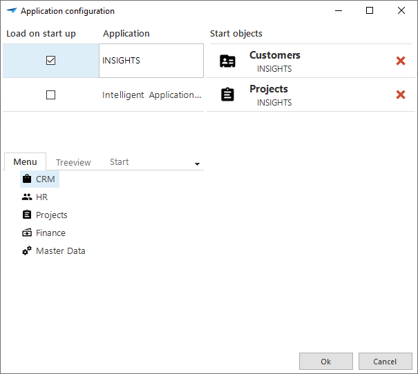 Application configuration via the toolbar
Which applications must be loaded at the start can be indicated on the top left by means of the 'Check box' next to the application.
Along with starting a specific application it can also be specified which screen must start when the application is started. We call this the 'Start object'. This can be dragged to the start objects at the top right from the quick launch toolbar or tree structure on the bottom left.
Configuration of an active object
The following settings can be changed when configuring the active subject:
General parameters
The columns and sequence in the grid
The columns for searching and filtering
The detail tabs
The following popup opens when the 'Subject Configuration' is opened.
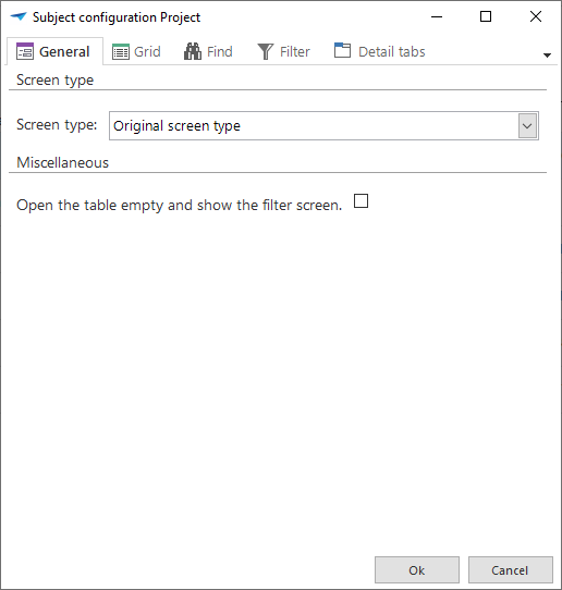 Subject configuration
General parameters
Within the 'General' tab in the subject configuration it is possible to indicate whether the table must start empty, so that this can be filled in with filters. This can be chosen for by the developer to avoid that long lists with data must be retrieved, which must then be filtered.
Grid
The 'Grid' tab displays the columns that are displayed in the grid and their sequence.
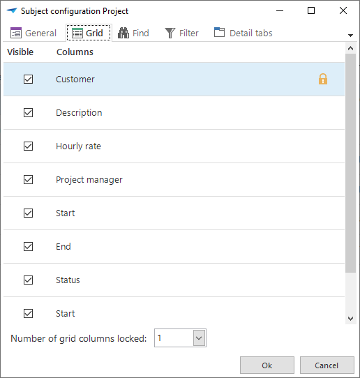
The user can check which columns must be displayed. Furthermore the columns can be dragged in the required sequence.
There is also the option to fix several columns in the grid. This can be useful when there are many columns in the grid. The fixed grid columns are always displayed in the grid. Even if the user makes use of the scroll bar.
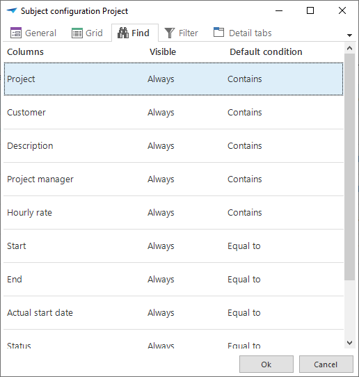
Search
Within the subject configuration 'Search' it is possible to indicate which columns must or must not be visible, within a search view. It can also be indicated which default condition a search field contains. The subject is always dependent on the work screen in question that is opened.
 Search within the Object configuration
It can be indicated in the field 'Visible' which columns must and must not be visible when the look up popup appears. The choice can be made between always visible or never visible, which speaks for itself. The 'Expanded' option means that this column as default is not displayed, but that the popup can be further expanded to also display these columns.
Filter
Selecting the columns on which the user wants to filter works in exactly the same manner as the selection of the columns on which the user wants to search (see 0).
Detail tabs
Via the 'Detail tabs' tab it can be defined which detail subjects must be displayed as a tab for the chosen subject.
This works in the same manner as selecting columns in the grid (see 0). Also here the sequence of the tabs can be adjusted.
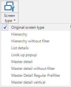
Screen type
When the user wants to use another screen type this can be selected via the 'Screen type' button in the toolbar. In the grid that then opens a number of screen types are available which are predefined by the developer. The option to return to the original screen type ia always available at the top of the grid.
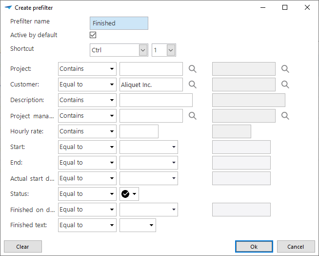
Create prefilter
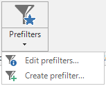
Creating a prefilter ensures that an own defined prefilter can be applied under the work screen in question. By opening the prefilter in the toolbar the option appears to create a prefilter. With this the user opens the following popup.
 Prefilter in the toolbar
 Create a prefilter
When creating a prefilter a name must first be entered. The user then has the following options:
Active by default
The choice can be made to enable the prefilter as default when the subject in question is displayed. This happens by ticking the check mark.Shortcut
Which keyboard combination can be used to enable or disable the prefilter can be defined here.Column filter
A filter condition and the value on which needs to be filtered can be selected for every available column. Dependent on the filter condition a begin and end value can be entered.
With the ´Clear´ button all filter conditions are rest to their original value. Furthermore this clears all filter values in one go.
The editing or deleting of an own prefilter, also takes place via the ´Prefilters´ tab in the toolbar.
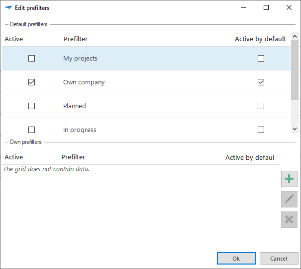 Edit prefilters
Help
To support the user even better it is possible to call up a help document. In
this document the developer can specify what the various components within the
application are used for. The help can be accessed in two ways, via the menu bar
under the Help  button at the top right of
the screen and by pressing the
button at the top right of
the screen and by pressing the F1 key at an arbitrary place in the
application.
Help via the menu bar
Help via the menu bar opens the Help in the main menu. This is the starting point for the user to search for himself via the content or via the search option. This method is particularly easy when general information about the program is sought.
Help via F1
The help via the F1 key, the so-called context-sensitive help, leads the user
directly to the subject which is selected at that time. A specific explanation
can be found here about the field that is selected. When a tab and not a field
is selected then the help for the entire table is displayed. If there is no help
available for the selected subject then this is displayed empty.
Using Help
The help page appears when the help is opened.
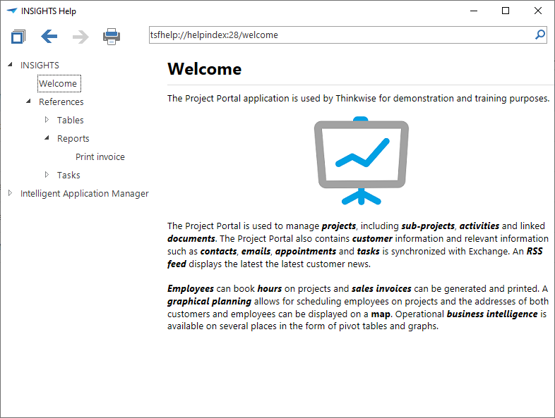 The help menu
This page is divided into a number of sections. There is a menu available on the left-hand side where the different sections (tables) can be found. When these are expanded the underlying information of the columns is available. The possibility to collapse all the table of contents is available in the toolbar at the top of the help screen.
The arrows can be used to navigate within the table of contents. This makes it possible to navigate forwards and backwards.
To be able to provide the help functionality on paper, it is possible to print it. This option is available thanks to the print icon in the toolbar.
TIP
The requested screen is printed and not the entire help document.
Navigation with the help of the keyboard
The most obvious navigation method is with the help of the mouse cursor to navigate and the keyboard for data entry. It is however also possible to navigate with the keyboard. This is particularly of importance when working with large data volumes.
Shortcuts
Some of the shortcuts may be blocked or result in different behavior when using the Web GUI, depending on the browser that is used.
| Shortcut | ||
|---|---|---|
  | Objective | Next row |
| Description | To go to the next set of data in the form with the help of the keyboard. | |
| When | With the help of this shortcut it is possible to display the following set of data in the form without the use of the mouse. | |
 | Objective | Previous row |
| Description | To go to the previous record in the form with the help of the keyboard. | |
| When | With the help of this shortcut it is possible to display the previous set of data in the form without the use of the mouse. | |
 | Objective | Adding a row |
| Description | To add a row the grid or the input screen, in which an extra row must be added, must be activated. It is possible to click on Ctrl and + to add an additional row. | |
| When | With the help of this shortcut it is possible to add a row without the use of the mouse. | |
 | Objective | Confirmation and adding a row |
| Description | To save a new row and to add another row immediately after that, press Ctrl en + . The row just added is stored and immediately afterwards it is possible to proceed with the addition of a new row. | |
| When | With the help of this shortcut it is possible to add several rows one after another without a mouse | |
| | Objective | Save and copy to new |
| Description | To save a row and immediately add a another row with largely the same data it is possible to make use of this shortcut combination. | |
| When | This shortcut combination can be used when adding data that is for the most part the same. For example, the addition of addresses for the same street. The only difference is the house number. | |
 | Objective | Deleting a row |
| Description | To remove data in an input screen press Ctrl and -. | |
| When | With the help of this shortcut it is possible to add a row without the use of the mouse. | |
 | Objective | Editing a row |
| Description | To edit data in an input screen press Ctrl and e. | |
| When | With the help of this shortcut it is possible to edit a row without the use of the mouse. | |
| | Objective | Edit mode |
| Description | To edit data in a grid press Ctrl and Alt with E. From that moment it is possible to directly edit the data in the grid. | |
| When | With the help of this shortcut it is possible to quickly edit several rows at the same time without the use of the mouse. | |
 | Objective | Confirmation of a row |
| Description | To save a new row press on Ctrl and ENTER. The row just added is then saved. | |
 | Objective | Cancel |
| Description | If it is necessary to cancel the processing of data, then this can be done using the ESC key. | |
| When | With the help of this shortcut it is possible to cancel the data entered in the input field. For example, an address is being entered but it turns out to be incorrect. | |
 | Objective | Refresh the data |
| Description | To refresh the data in a screen press F5. The data of the solution is then re-loaded from the central storage location. Apart from the current table the tables which are referred to are also refreshed. Only the selected row of higher level subjects is updated. The data in all sub-components is also updated. | |
| When | This shortcut can best be used if several users are working with the data in the same screen. For example, an input screen for addresses. | |
 | Objective | Search |
| Description | To search for specific data in the columns press Ctrl + F. At that moment a screen is opened, in which it can be specifically indicated which data is being searched for. | |
| When | It is possible to search for specific data with this shortcut. For example, to search for the name of the street of the address with postcode 7324 AE and house number 7B. | |
 | Objective | Find next |
| Description | Search for the following row that satisfies the criteria that is defined in the search screen. | |
| When | Search in the following row without entering criteria in a pop-up window. | |
 | Objective | Find previous |
| Description | Search for the previous row that satisfies the criteria that is defined in the search screen. | |
| When | Search in the previous row without entering criteria in a pop-up window. | |
 | Objective | Filter |
| Description | To filter rows on a specific value or criteria of a column which the data must satisfy press Ctrl + R. | |
| When | With the help of this shortcut it is possible to create a list of rows for which specific data satisfies the stated criteria. For example, a list of addresses for which the postcode starts with 10. | |
| | Objective | Clear filter |
| Description | An active filter on a grid can be cleared with this shortcut combination. | |
| When | An activated filter on a grid can be cleared with this shortcut combination. | |
| | Objective | Quick filtering |
| Description | The value of the active cell in a grid is added to the active filter. This function can be used several times consecutively on various columns, whereby the set of data becomes smaller. | |
| When | To quickly filter on the active cell without having to complete a pop-up window. | |
 | Objective | Combined filter |
| Description | Moves the focus to the combined filter. | |
| When | To quickly filter in the current set of data on a combination of columns. | |
 | Objective | Sort |
| Description | To sort columns in a specific sequence press Ctrl + S. At that moment a screen is opened in which you can indicate in which sequence certain columns must be sorted. | |
| When | With the help of this shortcut it is possible to create a ranking of the data in a grid. For example, sorting the postcodes of an address in ascending order. | |
| | Objective | Default sort |
| Description | The default sorting of columns can be returned to its original situation. | |
| When | Screens can have a predefined sort sequence on columns. This can be changed during work. The given shortcut can be used to reset this sort sequence. | |
 | Objective | First row |
| Description | To go to the first row of a grid, it is useful to select a row so that the solution knows which grid it must use and then press on Ctrl+ HOME. | |
| When | With the help of this shortcut it is possible to quickly go to the first row in a long grid. | |
 | Objective | Last row |
| Description | To go to the last row of a grid, it is useful to select a row so that the solution knows which grid it must use and then press on Ctrl+ END. | |
| When | With the help of this shortcut it is possible to quickly go to the last row in a long grid. | |
| Objective | Going through fields and tabs in a form |
| Description | To go through all the fields in a form, also the fields on the next tab, use the ENTER key. Any buttons behind the input fields are passed over. | |
| When | This key can be used when a form is used that consists of several tabs, so that all fields can be gone through. | |
| | Objective | Going backwards through fields and tabs in a form |
| Description | To return to a previous field in a form, also to fields in a previous tab, you can use the Shift and ENTER key combination. | |
| When | With the help of this shortcut it is possible to move through an input field when a form is used that consists of several tabs. | |
| | Objective | New line in a text field |
| Description | To start a new line in a text field the key combination Alt + Enter should be used. | |
| When | With the help of this shortcut it is possible to start a new line in a text field | |
 | Objective | Previous tab |
| Description | To return to a previous tab in a form the key combination Ctrl + PgUp can be used. | |
| When | Within a form the previous tab can be selected with the shortcut Ctrl + PgUp. For example, during the input of a form it is useful to return to a previous tab to re-check the data. | |
 | Objective | Next tab |
| Description | To go to a next tab in a form it is possible to use the shortcut Ctrl and PgDn. | |
| When | Within a form select the next tab using the shortcut Ctrl + PgDn. For example, during the completion of a form it is useful to go to a following tab to check which data must still be entered. | |
 | Objective | To form input tab |
| Description | To move quickly between tabs. | |
| When | When a form has several tabs a number will appear behind it so that this tab can be quickly accessed. | |
| + click on menu item | Objective | Open new document |
| Description | To re-open an already opened screen. | |
| When | By opening the same screen it is possible to open several screens with the same data. For example when a relation is updated and during the update the user wants to reference another relation. | |
 | Objective | Copy to the clipboard to then paste into another program |
| Description | It is possible to copy data from a grid to the clipboard. By selecting the rows that are required to be copied from the solution. If the rows are consecutive and it is necessary to select several rows, than it is possible to hold down the Shift key. If thie rows are not consecutive then it is useful to hold the Ctrl key. | |
| When | With the help of this shortcut it is possible to copy specific data to another program. | |
| | Objective | Automatically resize grid columns |
| Description | With the help of this shortcut it is possible to automatically give all columns on the screen the required width. | |
| When | With the help of this shortcut it is possible, when a column has too little space, to completely display the data that is in this column. For example with a long street name that does not fit in the field it is possible to automatically adjust the width for all columns so that the long street name becomes completely visible. | |
 | Objective | Switch between components |
| Description | To switch between the various components (Grid, form, tabs) | |
| When | If, for instance, it is necessary to switch between grid and form. | |
  | Objective | Switch between tab levels |
| Description | To switch between the various levels of tabs it is also possible to use the arrow keys, as a faster Alternative for F6. These keys only work when the title of a tab is selected. | |
| When | ||
 | Objective | |
| Description | Send the visible data to the printer by using the key combination Ctrl + P. | |
| When | With the help of this shortcut it is possible to print the screen. For example, the creation of a grid on the work screen with the help of a filter and you want to quickly print this grid for a short consultation with a colleague. | |
 | Objective | Go through fields in row and form |
| Description | To go from one selected data set in a screen to the next data set use can be made of the TAB key. This makes it possible to select input fields as well as the buttons behind the input fields. When using the TAB key the user continues working in the same tab. It is therefore not possible to go through all the input fields, as is possible with use of the ENTER key. | |
| When | At the moment that the user of a row or form wants to jump from one data set to the following data set. | |
| | Objective | Going back through fields in a row and form |
| Description | To return to the previous field in a form. | |
| When | ||
 | Objective | Switch between row and cell selection |
| Description | When data is edited in a grid (for instance after using the shortcut Ctrl + Alt + E), it is possible byusing Ctrl + SPACE to ensure that this row is selected, instead of a cell, or vice-versa. | |
| When | With the help of this shortcut it is possible to influence the operation of other shortcuts, while data is being edited. For example: with Ctrl + C the contents of a cell or the contents of an entire row can be copied to the clipboard. If a cell is selected, but it is useful to copy the entire row to the clipboard, then use is made of Ctrl + SPACE and then Ctrl + C to achieve this. | |
 | Objective | Open the look up popup |
| Description | When the user is editing data in the grid or form it is possible with Ctrl + L to open the look up popup of the active field. | |
| When |
Shortcuts for the grid
The grid shortcuts can be in three different situations:
- Read only (non-edit mode)
- Edit (grid edit mode)
- Edit of a field (cell edit mode)
The following shortcuts can only be used in the grid. The action that is subsequently carried out, is dependent on the situation of the grid. These are given on the following page.
| Shortcut | ||
|---|---|---|
| Non-edit mode | Focus on the first field in the current row. |
| Grid edit mode | Focus on the first editable field in the current row. | |
| Cell edit mode | Focus on the first character in current cell. | |
| Non-edit mode | Focus on the last field in the current row. |
| Grid edit mode | Focus on the last editable field in the current row. | |
| Cell edit mode | Focus on the last character in current cell. | |
| | Non-edit mode | Focus on the first field in the first row. |
| Grid edit mode | Focus on first editable field in the first row. | |
| Cell edit mode | Focus on the first character in current cell. | |
| | Non-edit mode | Focus on the last field in the last row. |
| Grid edit mode | Focus on the last editable field in the last row. | |
| Cell edit mode | Focus on the first character in current cell. | |
| Non-edit mode | Go to the next field. At the last field go to the first field on the next row. |
| | Non-edit mode | Go to the previous field. At the first field go to the last field on the previous row. |
| Non-edit mode | Go to the next field. At the last field go to the first field on the following row. |
| Grid edit mode | Go to following field in the current row. At the last field go to the first field on the following row. | |
| Cell edit mode | Go to the next field. At the last field go to the first field on the following row. | |
| | Non-edit mode | See TAB in opposite direction. |
| Grid edit mode | See TAB in opposite direction. | |
| Cell edit mode | See TAB in opposite direction. | |
| | Non-edit mode | Navigate through the grid. |
| Grid edit mode | Navigate through the grid. | |
| Cell edit mode | Navigate in the cell. In the case of a drop down the following or previous value is selected. | |
| | Non-edit mode | |
| Grid edit mode | ||
| Cell edit mode | Opens the selection grid of the current drop down field. | |
| Non-edit mode | Page up, hold same column. |
| Grid edit mode | Page up, hold same column. | |
| Cell edit mode | Page up, hold same column. | |
| Non-edit mode | Page down, hold same column. |
| Grid edit mode | Page down, hold same column. | |
| Cell edit mode | Page down, hold same column. | |
| Single click | Non-edit mode | Select cell. |
| Grid edit mode | Select cell. | |
| Cell edit mode | Select cell. | |
| Double click | Non-edit mode | If the grid is a detail subject, a new screen opens with the current grid as main subject. |
| Grid edit mode | ||
| Cell edit mode | ||
| Non-edit mode | |
| Grid edit mode | If record is changed, cancel changes otherwise go to grid in non-edit mode. | |
| Cell edit mode | Cancel changes. | |
| | Non-edit mode | |
| Grid edit mode | Save the current row. | |
| Cell edit mode | Save the current row. | |
| | Non-edit mode | Place the grid in grid edit mode. |
| Grid edit mode | Save the row. Place the grid in non-edit mode. | |
| Cell edit mode | Save the row. Place the grid in non-edit mode. | |
 | Non-edit mode | |
| Grid edit mode | Delete entire value from the cell. | |
| Cell edit mode | Delete selection or character. | |
 | Non-edit mode | |
| Grid edit mode | Delete entire value from the cell. To cell edit mode. | |
| Cell edit mode | Delete character in front of the cursor. |
Important concepts
To be able to work well with the program it is important that the user recognizes a number of definitions by name and understands what they mean.
This chapter contains a short explanation of the most important definitions
Tree structure menu
The tree structure menu is a menu structure on the side of the screen. This allows the user to navigate to a specific section of the program.
Context menu
The context menu is the menu that appears when the user clicks on the right-hand mouse button in a form, grid, cube or graph. By clicking somewhere in the menu the described action is executed or you can initiate its execution.
Detail tab
The details belonging to a specific record are described on the detail tab.
Form
The data belonging to a specific record is clearly displayed in a form, the user can also edit the data in the form.
Main tab
The main tabs provide the possibility to quickly navigate between various open work screens. The subject of the associated work screen is shown on the main tab.
Button bar
The button bar is positioned at the bottom of a form. Using the button bar and with the help of the mouse cursor the user can navigate, add, edit and delete.
Grid
A grid is a summary of several records presented underneath each other.
Menu bar
The menu bar is the bar with buttons at the top the program. Each contains a number of options.
Maintaining data
Maintenance of data is the adding, editing or deleting of records
Record
A record is a row of data about a certain subject.
Quick launch toolbar
The quick launch toolbar is a menu structure on the side of the screen. This allows the user to navigate to a specific section of the program.
Quick launch toolbar group
A quick launch toolbar group is a collection of subjects in the quick launch toolbar that are associated with each other in a specific way.
Field
A field is a place where information about a specific subject in a record is displayed or can be edited.
Work screen
The work screen is the screen in the application where the user can edit data.