Screen types
The screen type of a subject (table or variant) determines the screen structure used to visualize the subject. There are four different levels for which a screen type can be specified:
Main screen: when the table is opened from the menu.
Detail screen: when a table is a detail of another table.
Pop-up screen: when a table opens as a pop-up.
Zoom screen: when a detail of another table is double clicked so it opens as a main size screen.
If the screen type is left empty, then the standard screen type, indicated at the project version, is used.
The screen types that are set up for the Windows and Web user interfaces are also used for Mobile. The Mobile user interface converts the screen types to a version that is suitable for smartphone or tablet by analyzing which components are used in the screen type.
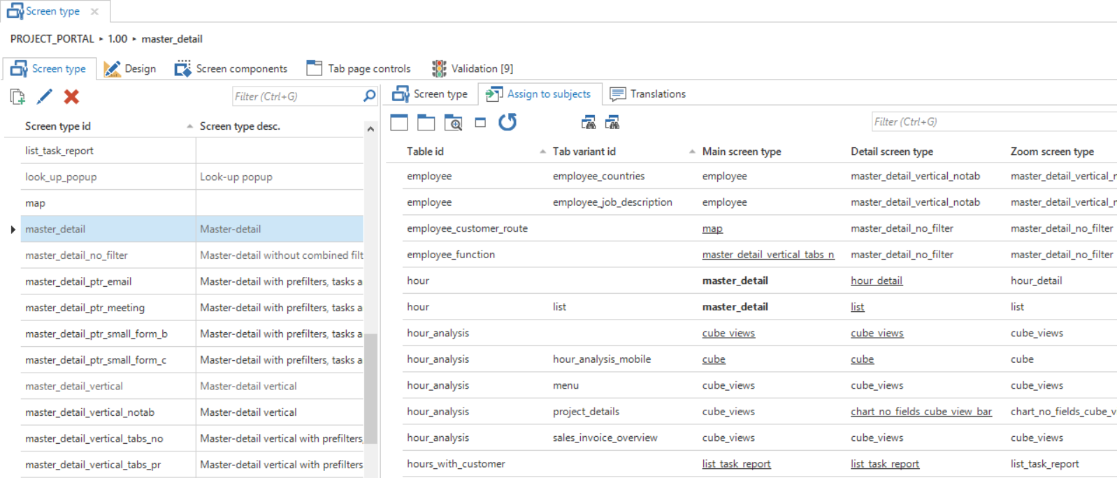
Assigning a screen type
To assign a screen type to a subject, follow these steps:
Select the screen type that has to be assigned to a specific table in the left hand list of screen types.
Select the relevant table(s) and variant(s) in the Assign to subjects tab to which this screen type has to be assigned.
Use the Assign screen type
 tasks to assign the selected screen type to the desired screen type levels of the selected subjects.
 Assigning screen types
If a selected screen type is used by a subject, then the name of the screen type is highlighted in bold. Underlined screen types are explicitly set up to deviate from the standard screen types defined at the project version.
Designing a screen type
To design a custom screen type, a new screen type first has to be created in the Screen type overview. The ID, and possibly a definition of this new screen type, is specified here.
Thinkwise recommends keeping the name of the screen type abstract, since it could be used in several places. Therefore, not customer but for instance parallel_detail.
When a screen type is especially developed for one process, then this screen is not suitable for use with other subjects. By turning off Available for user preferences, this screen is not displayed in the user interfaces when switching screen types with user preferences.
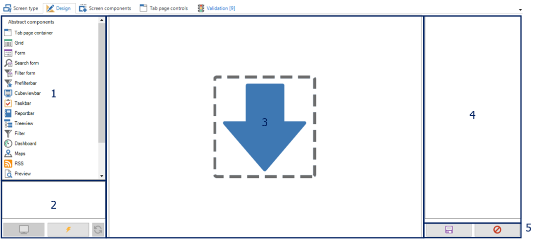
When a new screen type is created, it can be designed on the Design tab. This tab consists of a number of parts which are explained in more detail in the table below.
 Designing a screen type
- Abstract components - In this component, an overview is presented of the available abstract screen components that can be dragged onto the work sheet.
- Preview - With the help of these buttons, a screen type can be tested on an existing end product.
- Work sheet - This is the work sheet on which the various components are dragged to construct a screen type.
- Overview of properties - The properties of the selected component are presented here. These can be manually adjusted.
- Save and reset - The modifications can be saved or undone using these buttons.
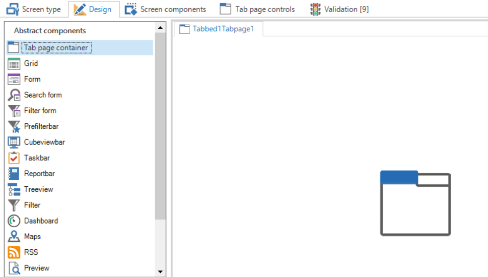
During the design of a screen type, various abstract components are available which can be dragged onto the work sheet.
| Icon | Component | Explanation |
|---|---|---|
 | Tab container | The tab container ensures that several tabs can be used under which the details or other components can be classified. Empty tabs are removed by the user interface. |
 | Grid | The data are displayed under each other in the grid and can be selected. The user interface will remove the grid if there can only be at most one line. |
 | Form | Data from one row can be presented and modified in the form. |
 | Form list | This component displays a form without tab pages for every row in the grid. All the forms will be stacked and a scrollbar will be created when it exceeds the screen. |
 | Search form | The search form provides an overview of the (limited) search set on the screen. |
 | Filter form | The filter form provides an overview of the (limited) filter set on the screen. |
 | Prefilter bar | A button for all prefilters is displayed in this bar. The user interface will remove this component if there are no (visible) prefilters. |
 | Cube view bar | A button for all cube views is displayed in this bar. The user interface will remove this component if there are no cube views. |
 | Task bar | A button for all tasks is displayed in this bar. The user interface will remove this component if there are no tasks. |
 | Reports bar | A button for all reports is displayed in this bar. The user interface will remove this component if there are no reports. |
 | Tree structure | Displays a tree structure. The user interface will remove the structure if there can only be at most one row. |
 | Filter | The filter can be used for quick filtering on several columns. |
 | Dashboard | Displays the data in a Dashboard form. The user interface will remove the component if there is no maps definition for the table. At the time of writing, this can only be created with an object model extender. |
 | Maps | The Maps component displays a folder in which data can be viewed. The user interface will remove the component if there is no maps definition for the table. At the time of writing, this can only be created with an object model extender. |
 | RSS | Displays an overview in which RSS feeds can be presented. The user interface will remove the component if there is no RSS definition for the table. At the time of writing, this can only be created with an object model extender. |
 | Preview | Displays the first column of a table that contains a path (for instance URL or file upload control). |
 | Pivot table | Provides the possibility to display a pivot table. The user interface will remove the pivot table if there is no cube definition for the table. |
 | Pivot table fields | Provides the possibility to display fields that can be dragged and dropped in a pivot table. The user interface will remove the pivot table fields if there is no cube definition for the table. |
 | Graph | Displays a graph on the screen. The user interface will remove the pivot table if there is no cube definition with a graph for the table. |
 | Scheduler | The scheduler displays a graphical planning. The user interface will remove the component if there is no scheduler definition for the table. At the time of writing, this can only be created with an object model extender. |
 | Detail tiles | This component shows the details of a subject in tiles. Clicking on a tile will open a new document. |
The maps component has a restriction of a maximum of 2,500 geo location retrievals per customer per day.
All these components can be dragged to and dropped on the work sheet to compose the required screen. When the first component is dragged onto the work sheet, this will fill the complete page. When another component is subsequently dragged onto the work sheet, a frame will appear at the position where this is dragged to. The components on the work space can be moved freely by dragging them.
It is possible to display several button bars and the filter next to each other instead of under each other. This allows more efficient use of the available space. White space between the various components (prefilter, report, tasks and filter) is added automatically.
Tab container
The tab page container has two functions:
Tab pages for components
Tab pages for details
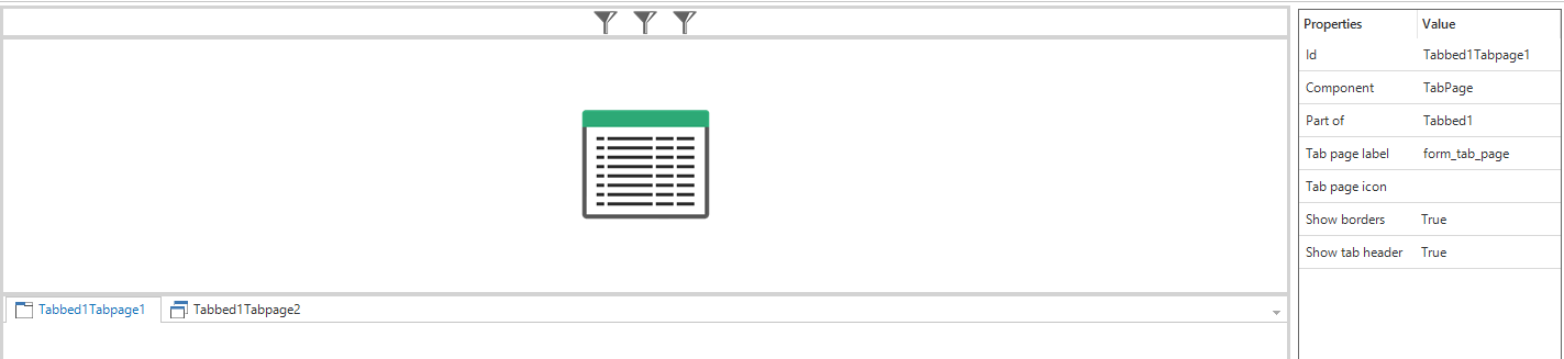
 An empty tab page container
Tabs can be added via the context menu of the tab container.
Component tab page
To drag components in a component tab, the status of the tab needs to be set to Edit tabs via the context menu (right mouse button). On the right-hand side of the screen, it is indicated for each screen component whether the size of the component must remain fixed when changing the size of the screen.
By setting up a tab control for a component tab, it is possible to influence the translation and the icon of the tab. New controls can also be added via the Tab controls tab. The standard can be overwritten by adding an own icon and translation.
Detail tab page
When use needs to be made of a tab container containing the details of the subject, then the status of the tab on Detail tab needs to be set with the help of the Change component tab page to detail option in the context menu (right mouse button). The tab will then become gray and the details will be initialized on the basis of the definitions of the subject. It also needs to be indicated which details are displayed on this detail tab by selecting a tab control for the detail tab on the right-hand side of the screen.
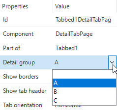
As standard, there is a choice from the options A, B and C, but new detail controls can also be added under Tab controls. An own icon can also be added here.
In the Subjects screen, the details of subjects can be distributed across the various detail tabs that are present in a screen. If a set tab control is not present on the chosen screen type, then the detail is placed on the first detail tab.
 Detail tab page groups
Hiding tab headers and lines in the screen type modeler
This option enables the user to hide the tab header completely or only hide the line. These are:
Show tab header
Show borders
These properties can both be set to false to hide their respective properties.
 Tab page properties
Preview
When the screen is developed according to your wishes, it is possible to display a preview of the screen in the Software Factory.
First, connect to an end product by clicking the Connect  button. Then select the table which it needs to be connected to and click the Preview
  button. A new document will open inside the Software Factory development environment, showing the screen type applied to the selected subject.
The model is re-loaded with the Refresh button.
When making the connection, use the Thinkwise Mock Database provider to display a preview without the end product. The preview is then displayed with dummy data.
Screen components
The Screen components tab displays an overview of the components on the selected screen type in a tree structure. A number of advanced settings of the screen type can be adjusted in this overview.
The height or width of components can be set to a fixed number of pixels or a percentage. Depending on the orientation of the component, the width or height including units (pixels or percentage) need to be modified, and the option Fix on resize needs to be on.
Breakpoints
Responsive screen type design means to design screen types that work well on mobile, tablet, and desktop devices. Using breakpoints in combination with screen types, a responsive screen can be setup. Breakpoints are the point at which your GUI will respond by changing the screen type to present the data with the best possible layout.
For every screen type one or more breakpoints can be defined. A breakpoint consists of a Breakpoint in pixels and a Breakpoint screen type. When the width of a screen type becomes smaller than the defined number of pixels in Breakpoint, then the screen type will change to the Breakpoint screen type.
It is even possible to define more breakpoints:
| Breakpoint (px) | Breakpoint screen type |
|---|---|
| 600 | master_detail |
| 400 | card_list_form |
| 200 | card_list_only |
In this situation the screen type in the GUI becomes master_detail when the number of pixels is between 400 and 600. When the screen is made smaller, between 200 and 400 pixels, the GUI switches the screen type to card_list_form. And when the screen is smaller than 200 pixels, the GUI will show screen type card_list_only.